CSS Text Formatting
How you display your text on a web page is really important. If people don’t feel at ease reading your page, they will go elsewhere. Given that most web pages have a whole bunch of text on them, getting your text formatting wrong could make or break people’s experience of your website.
If you haven’t read our tutorial on Fonts in HTML, I suggest you go ahead and read that and then come back!
Choosing the Right Font
Before delving into CSS, the first challenge is choosing the right font. You may employ more than one typeset – say for headings and paragraph text. But before you go ahead and make your decision, bear in mind the following:
- The clarity of the font shapes: the text must be easy to read at any size. That means you may choose to go for a ‘non fancy’ font for most of your paragraph content. Choosing smooth, rounded typography may be an option. Try out the font in a Wordprocessor document at different sizes and see if it’s still readable.
- Bold and Italic: some fonts look great until you try to make them bold or italic. Check that there is no fuzziness in readability so that you have maximum flexibility regardless of how you format your text.
- Licensing: Please please please check that you have the right to use the font on your website. Not all licenses cover font embedding, even if you can download the font for free. Check the license! Font Squirrel’s generator can tell you if a font is blocked due to license. If in doubt, purchase the font.
Okay so you have your font and you’ve embedded it using @font-face. Let’s look at the following options:
p{ font-family:'Open Sans','Trebuchet MS','Arial','sans-serif'; font-size:14px; color:#333; letter-spacing:1px; line-height:1.2; font-weight:normal; font-style:italic; text-transform:none; text-align:center; text-decoration:none; text-indent:10px; text-shadow:3px 3px 3px #ccc;} font-family Declaration
I don’t want to repeat myself too much here, but just as a reminder, the font-family is a list of font names in order of preference. Always ensure you have spelt these correctly and that you have ‘fallback’ options in case one of your typesets fail for any reason.
font-size Declaration
As I have already discussed this in the previous tutorial have a look at this for more detail about font size. A quick summary is: you can use absolute sizes (e.g. in pixels as in this example) or in relative sizes (e.g. percentages).
color Declaration
Next to the font set you have chosen getting your color right is important. In order to make your text readable, the colour should be a strong contrast to your site’s background but not so strong as to make it harsh (e.g. pure white on a pure black background). It may take some experimentation to find a colour that suits your website. I have found that tempering your colour can work well.
What I mean is, if you have a white background, instead of going for black text #000000, you can go for a dark grey (e.g. #333333). And on a darker background, instead of going for pure white text (#ffffff), go for a very light grey (e.g. #dddddd). Find what works for you – and what doesn’t hurt your eyes or head when you try to read it!
letter-spacing Declaration
This determines how far apart each letter is in your paragraph. You can use letter-spacing to increase or decrease the space between individual characters.
- This is letter-spacing at 0px
- This is letter-spacing at -1px
- This is letter-spacing at 3px
What works with your font-family may not work with my font choice. So experiment to find out what letter-spacing works on your web page.
line-height Declaration
Where as letter-spacing is the space between letters, line-height determines how much or how little space to have between each invidual line of your text. Common ways to set the line-height are:
- Number: if you use a number (as we did in the example), it will take your font-size and multiply it by the number have set in
line-height. So myfont-sizeis 14px. My line height is 1.2. That makes my actual line height: 14px × 1.2 = 16.8px. - Percentage: as with number, if you specify a percentage then your font-size will be multiplied by the percentage. So if I had specified
line-height:120%;it would have given me the same outcome asline-height:1.2. - Absolute Measurement: if you want you can set an absolute measurement – e.g.
line-height:17px;. That is also fine, but you may have to remember to change this if you adjust your font-size. With relative line-heights, they scale as your font-size changes.
font-weight Declaration
 The
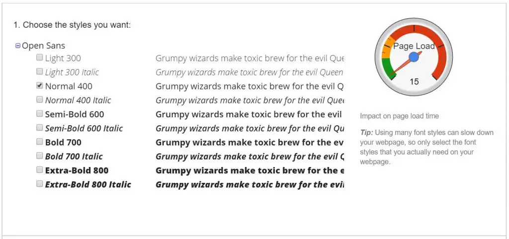
The font-weight declaration determines how ‘thick’ each letter will be drawn. If you use Google Fonts, for example, you can often choosea range of ‘weights’. So in this example you can choose: 300, 400, 600, 700 or 800. Each weight is ‘heavier’ than the previous one.
So font-weight can be specified a number of ways
- Numerical Weight: using the weights available as per the screenshot here.
- Bold: specify that you want generic bold text in CSS.
- Normal: will make your font appear how it does by default. Note, if your font choice is bold already, then your text will appear bold even if you set the ‘normal’ option!
- Bolder / Lighter: if supported, you can make your text format appear a little bit more or less bold. In practice I haven’t seen this work very often.
font-style Declaration
This is really straight forward, so I’ll just give you the options!
- normal: how the font family appears before any modification.
- italic: displays the selected text (in this case all
<p>tags) - oblique: this creates (if supported) a kind of ‘bold-italic’ text.
text-transform Declaration
text-transform is used to modify how the paragraph text is rendered in the browser regardless of how it is typed in the HTML.
- none: renders the text exactly how it is typed in your HTML. This is the default behaviour if you don’t specify
text-transform - uppercase: capitalises all of your letters, even if they were a mixture of both upper and lowercase originally.
- lowercase: shows all letters in lowercase even if they were a mixture of upper and lower case when written.
- capitalize: This text has been capitalized. View the source to see how I typed it.
text-align Declaration
You can specify how you want to align your text, in the same way you would when writing a letter in a word processor. It take the following values: left, right, center and justify.
Justified text is like in a newspaper where the text fits to the left and right of a column. In reality on the web, there will be few siutations where justified text is needed. Doing so creates uneven word spacing which can make your text hard to read.
text-decoration Declaration
I’ll add a short tutorial after this one on the most common use of text-decoration which is to remove the underlining from links. But you can specify different values for text-decoration:
- blink: creates text that effectively ‘flashes on and off’. This can be annoying to users but you might use it for a warning. In reality, most modern browsers don’t support this any more, probably because it’s annoying!
- underline: underlines the text within the given tag. Just be careful with underlined text as people still consider underlined wording to be clickable.
- overline: add a line on top of your text. You might use this along with underline, say, for an invoice total.
- line-through: as a line through your text. This is similar to using
<s>strike through</s>HTML Tags.
text-indent Declaration
Does what it says on the tin. This text, for example has a text-indent of 20px. You will notice that the paragraph starts deeper into the line compared to other text on this page. Note this does not move the whole paragraph, it just indents for the first line.
text-shadow Declaration
And the last one for this CSS Text Formatting Tutorial is text-shadow. As the name implies it adds a shadow to your text (depending on if your browser supports it). Text shadow has various components which make up its ‘rules’.
text-shadow:[left position] [top position] [blur size] [color]
Example of text-shadow in action using: 3px 3px 3px #ccc;
Example of text-shadow in action using: 0px 0px 4px #f00;
As this takes a bit more rendering, only apply text-shadow if you’re trying to make a particular point, or make a certain portion of text stand out.
TL;DR CSS Text Formatting
This is an introduction into the different styles of text formats you can apply within your CSS. Have a play around with some. If you have any questions feel free to use the comments – I respond most days!
